Interior · False Ceiling Wordpress
Crafting a high‑converting, mobile‑first website for a local interior & false‑ceiling studio, turning offline reputation into a digital lead‑generation engine.
Project Snapshot
• Platform: Marketing website + Web app
• Domain: Health insurance / Insurtech
• Scope: Landing page redesign & 33+ web UX screens
• My Role: UI/UX Designer (solo)
Key Responsibilities
• Stakeholder & user interviews
• User personas & journey mapping
• UX flows & low‑fi wireframes
• High‑fi UI & design system
• Front‑end & back-end build in WordPress
67%
Increase in Leads
First 3 months after launch vs previous period.
45%
Form Completion
4‑field enquiry form on desktop & mobile.
62%
Mobile Traffic Informs mobile‑first layout and navigation.

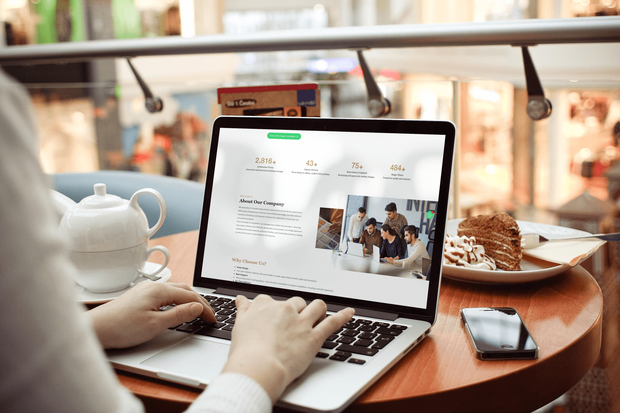
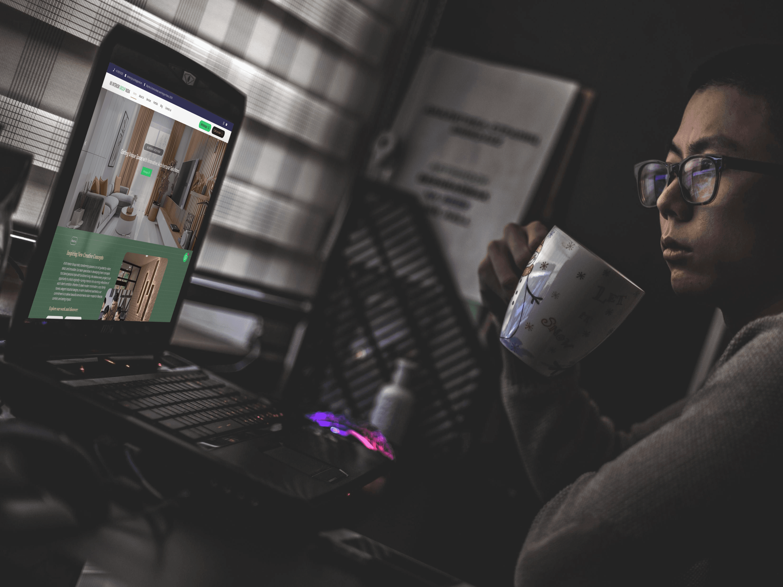
KK Interior Group is a small interior and false‑ceiling studio based in Lucknow, specialising in POP, gypsum and wooden ceilings for homes and commercial spaces. The owner relied mostly on word‑of‑mouth and WhatsApp photos, which made it hard to show the full range of work or handle new enquiries efficiently.
The goal was to design a portfolio‑driven website that feels premium, works flawlessly on mobile, and gives non‑technical owners a simple way to convert visitors into consultations without changing their existing workflow.
Users could not understand what services were offered, what different ceiling types cost, or whether the team was trustworthy. Competitor sites were either generic templates or overloaded with unstructured images, making it difficult for homeowners to compare options or take action confidently.
Research & Discovery
Research combined interviews with the owner and three recent clients, an audit of eight local competitors, and analysis of search behaviour for terms like “false ceiling Lucknow” and “POP design for hall”. Patterns showed that people want to see real projects, rough price expectations, and an easy contact option (mostly phone or WhatsApp) more than long marketing copy.
My Approach
A research‑driven redesign using design thinking: heuristic evaluation, analytics review, stakeholder interview, personas, journey mapping, ideation workshops, low‑fi wireframes, high‑fi mockups, and usability testing, followed by a custom WordPress implementation.
i add the Envira Gallery in that why every image comes with water maker of KK logo.
Three primary personas guided decisions on navigation, content depth and CTAs, ensuring the site works for different budgets and project scales.
Deepak · Modern Flat Owner
32–42, working professional upgrading a 2–3BHK flat. Wants a modern, clean ceiling design that fits a fixed budget and is completed on time.
• Needs to quickly see designs for
living room & bedroom.
• Wants an idea of price per sq. ft before calling.
• Prefers WhatsApp for quick follow‑up.
Priya · Commercial Space Owner
35–50, runs a showroom or office. Focused on finishing large areas fast, with clean lighting and minimal maintenance.
• Needs proof of large‑scale projects.
• Looks for trust signals and team capability.
• Prefers direct call scheduling.
Anjali · Family Renovation
28–40, renovating a family home. Wants “value for money” ceilings and clarity on what is included in the price.
• Needs simple language, minimal jargon.
• Wants to compare a few designs quickly.
• Uses mobile almost 100% of the time.
Website Flow
The main flow maps how a first‑time visitor discovers relevant work, builds trust through proof and then chooses a low‑friction way to contact the team.
Google search → user searches “false ceiling design in Lucknow”.
Landing on homepage → hero explains who KK Interior is and shows 3–4 hero projects.
Portfolio exploration → user filters projects by room type (living room/bedroom/office) and opens a relevant project.
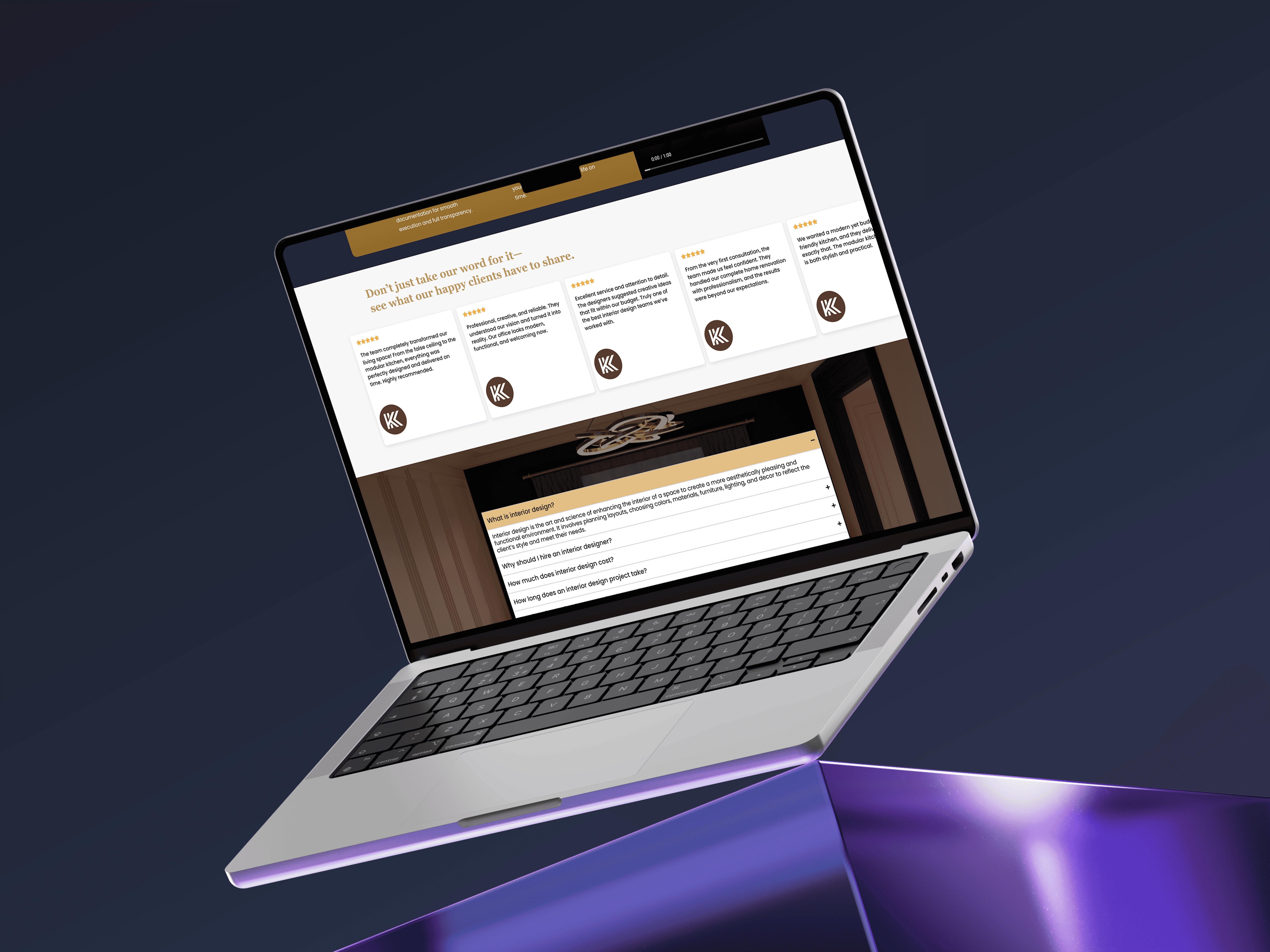
Trust building → project page shows multiple photos, materials, timeline and a short client quote.
Service understanding → user checks the “False Ceiling” service page for process and price bands.
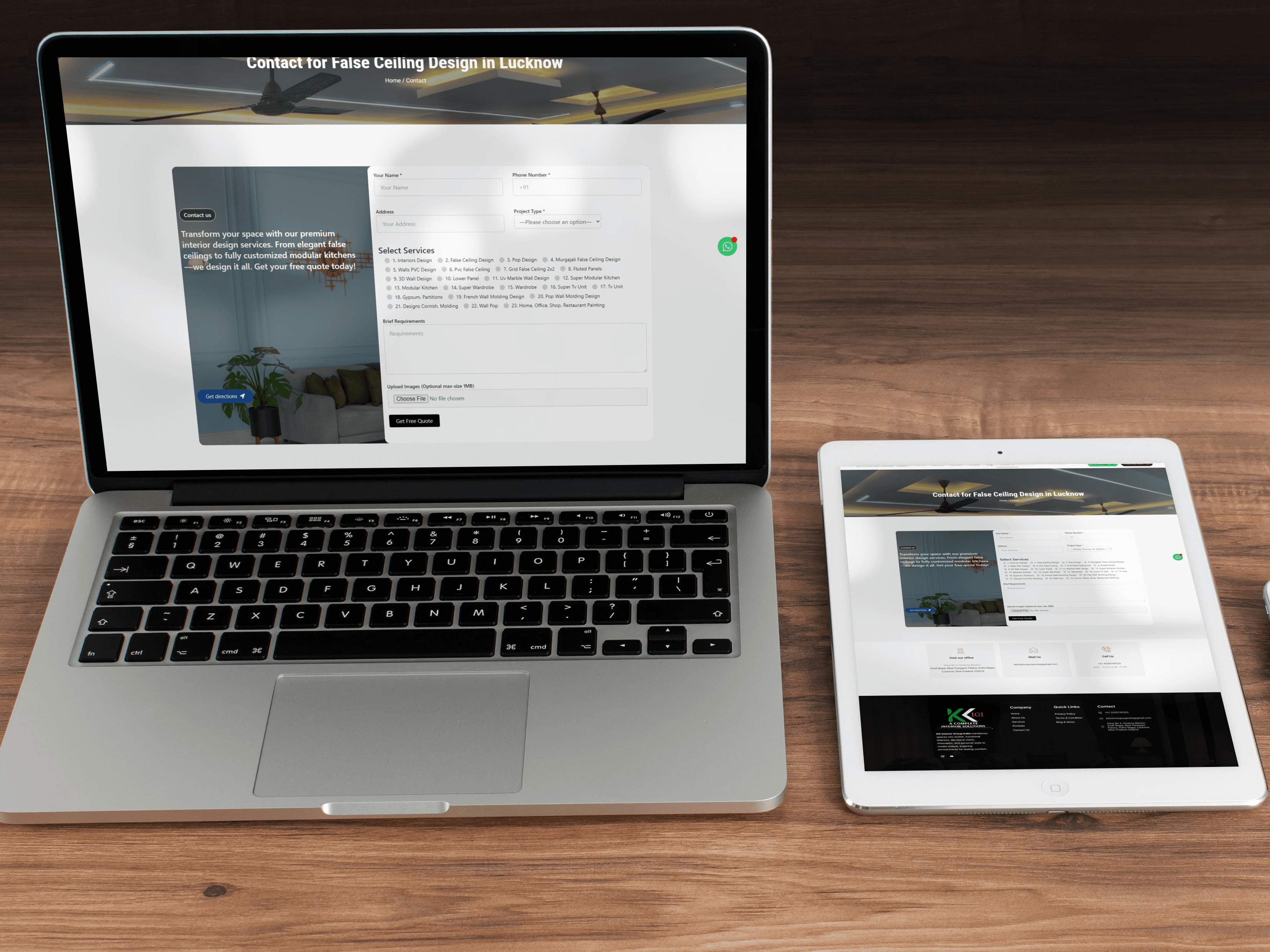
Conversion → user taps “Chat on WhatsApp” or submits the 4‑field consultation form to request a site visit.
Key Screens
The final UI uses a dark, cinematic base with cyan and amber accents that echo modern ceiling lighting, keeping focus on photography and calls‑to‑action.


The redesign followed a structured design thinking approach — empathizing with users, defining core problems, ideating solutions, prototyping layouts, and validating decisions through feedback.
Service terminology was simplified, navigation was restructured, and contact flows were embedded contextually to reduce friction at key moments.
The redesign focused on solving the highest‑impact UX problems uncovered during research.
Clear, jargon‑free services
Replaced the ambiguous “PPC” label with “Plaster of Paris Ceiling” and added plain‑language descriptions, photos, and FAQs so users understand each service in seconds.
Service Clarity
Service Clarity
Service Clarity
Service Clarity
Service Clarity
Language
Language
Language
Language
Language
Trust Design
Trust Design
Trust Design
Trust Design
Trust Design
Streamlined contact flow
Integrated a persistent 4‑field enquiry form and sticky WhatsApp / call CTAs across services and project pages, eliminating the need to hunt for contact details.
Form UX
Form UX
Form UX
Form UX
Form UX
Friction Reduction
Friction Reduction
Friction Reduction
Friction Reduction
Friction Reduction
Mobile‑first, responsive layout
Redesigned navigation and tap targets for smaller screens, simplified content blocks, and optimized spacing to reduce mobile bounce and make browsing effortless.
Contact Flow
Contact Flow
Contact Flow
Contact Flow
Contact Flow
Conversion‑Focused
Conversion‑Focused
Conversion‑Focused
Conversion‑Focused
Conversion‑Focused
Proof‑driven portfolio
Built a structured portfolio with filters and rich project detail pages, turning real work into the primary decision‑making driver and building trust faster.
Dashboard UX
Dashboard UX
Dashboard UX
Dashboard UX
Dashboard UX
Information Architecture
Information Architecture
Information Architecture
Information Architecture
Information Architecture
System Thinking
System Thinking
System Thinking
System Thinking
System Thinking
After launch, the site delivered a noticeable lift in qualified leads. The homepage now pushes visitors straight into the portfolio, and each project page ends with a contextual “Request similar design” CTA. A simplified 4‑field enquiry form and always‑visible WhatsApp button made it possible for busy homeowners to contact the team in seconds instead of hunting for phone numbers.
Over the first three months, KK Interior Group saw a 67% increase in enquiries, with form completion rising to 45% and WhatsApp becoming the dominant channel for new leads. Because the site is built on WordPress with reusable blocks, the owner can add new projects without touching code, turning the website into a living portfolio instead of a static brochure.
Figma, Miro, WordPress, Elementor, Google Analytics, Lighthouse , GA4 PHP, JS.
Portfolio visibility matters more than long service descriptions for interior buyers.
Offering both WhatsApp and a short form covers different comfort levels with contact.
Non‑technical clients need CMS structures that mirror how they talk about projects.