Portfolio
EdTech · Full App Redesign
EdTech · Mobile App + Web · Varanasi, India
Full App Redesign
Custom EMI System
Mobile + Web
Android First
Real Project
UX Research
9+
Payment flow versions tested
Full
Every screen, every flow redesigned
EMI
Online + offline payment system built
Flow maps existed when I started
Client
Pratyaksh Ayurveda
Varanasi, India
My Role
UI/UX Designer
(Sole Designer)
Platform
Mobile App (first)
+ Web
Scope
Full app redesign — every screen, flow, state, and
component
Tools
Figma · Hotjar · Notion
UX Research
01 — The product
— Aquib on the starting point of this project
"
02 — What was broken
01
No flow maps existed
Nobody had ever mapped how users moved
through the app. No onboarding flow, no
purchase flow, no user journey documentation. I
had to research, map, and then redesign
everything from zero.
→ Built complete flow system from scratch
04
No EMI option at all
Students spending ₹5,000–₹15,000 had to pay
the full amount upfront. No installment option, no
flexibility. This was directly killing conversions for
higher-priced courses.
→ Built full online + offline EMI system
02
Onboarding dropped users fast
The sign up, login, and onboarding screens were
confusing and too long. Students were leaving
before they ever saw a course. No guest mode
meant no way to explore without committing.
→ Full onboarding + guest mode redesign
05
Payment flow had 9 broken versions
The add to cart and checkout experience went
through 9 different versions before it worked
properly. Every version revealed new problems —
missing trust signals, confusing pricing, broken
coupon logic.
→ Version 9 — full payment flow with all features
03
Course discovery was broken
No proper categories, no recommendation
system, no way to filter by exam type. Students
couldn't find the right course for their specific
goal — BAMS, AIAPGET, AMO, or clinical.
→ New home, categories, recommendation cards
06
Profile and settings were incomplete
The user profile was minimal and the account
section was rebuilt twice — once designed, then
deleted, then redesigned properly 2 months later.
Settings, help, and support were afterthoughts.
→ Full profile, settings, help system redesigned
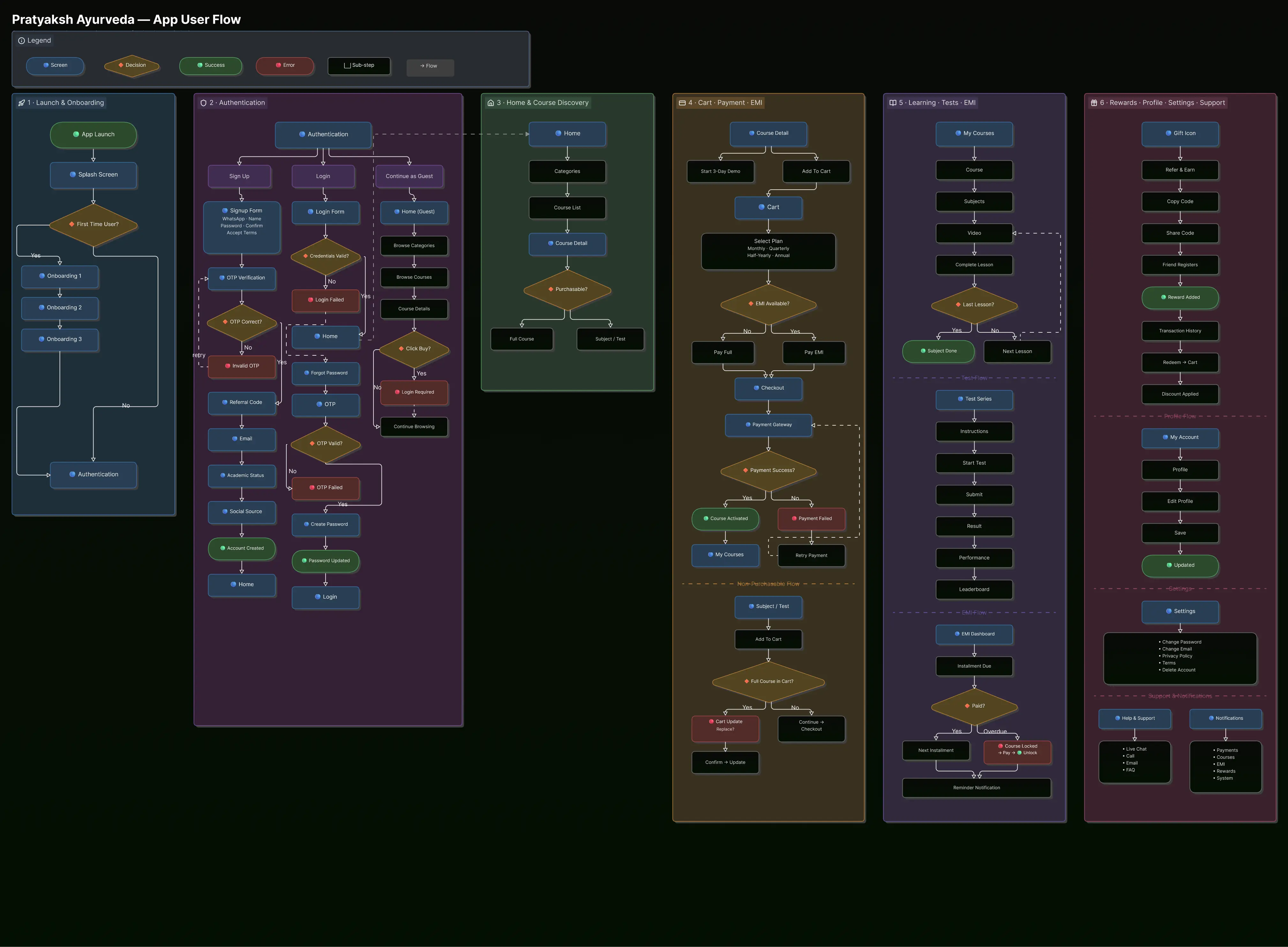
03 — First step: build the flow system
Before any screen design, I spent weeks mapping the entire product. Every user journey, every decision
point, every connection between screens. This became the foundation everything else was built on.
Step 01
Product Audit
Step 02
User Research
Step 03
Flow Mapping
Step 04
Architecture
Step 05
Design System
User Flow Map
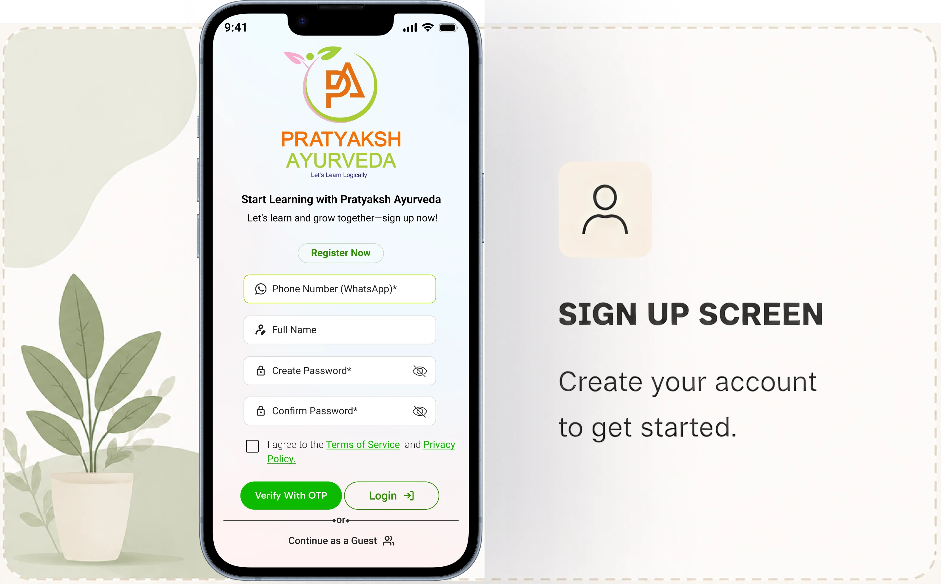
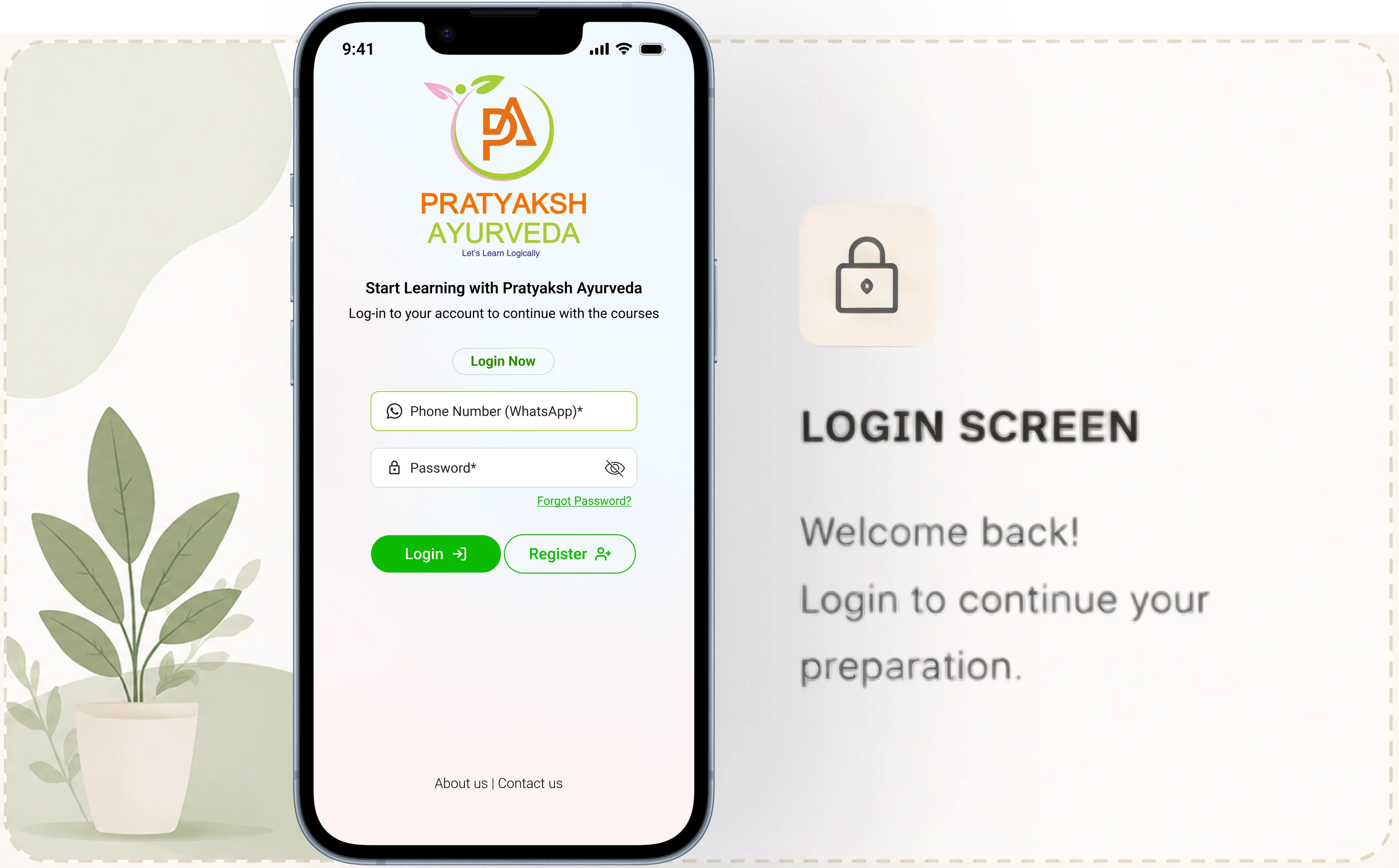
04 — Onboarding, auth & guest mode
Auth Flow
Sign Up, Login, Forgot Password
Sign Up
Login
OTP
Forgot Password
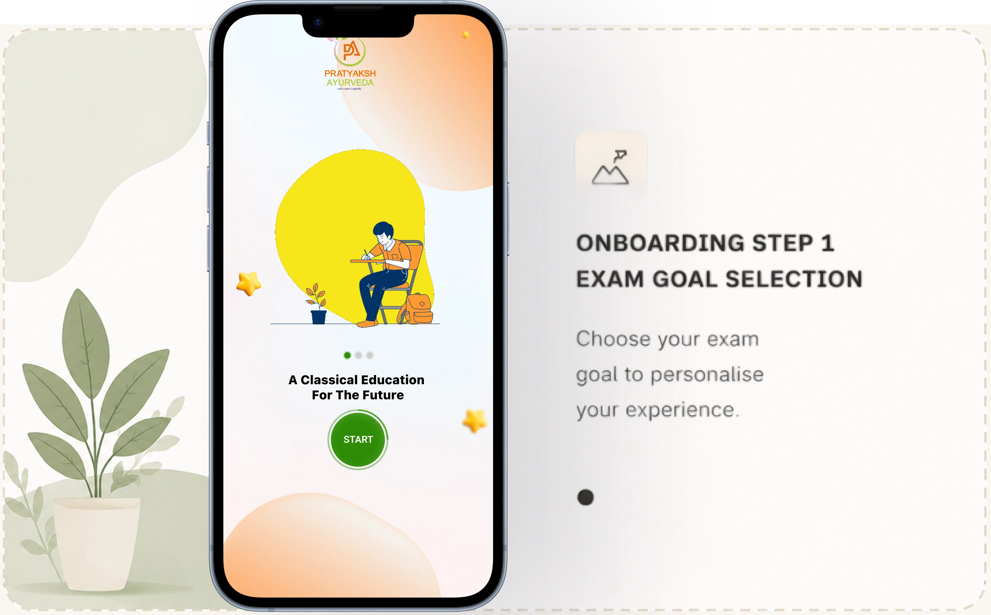
Onboarding
Progressive Onboarding + Guest Mode
Onboarding
Guest Mode
Personalisation


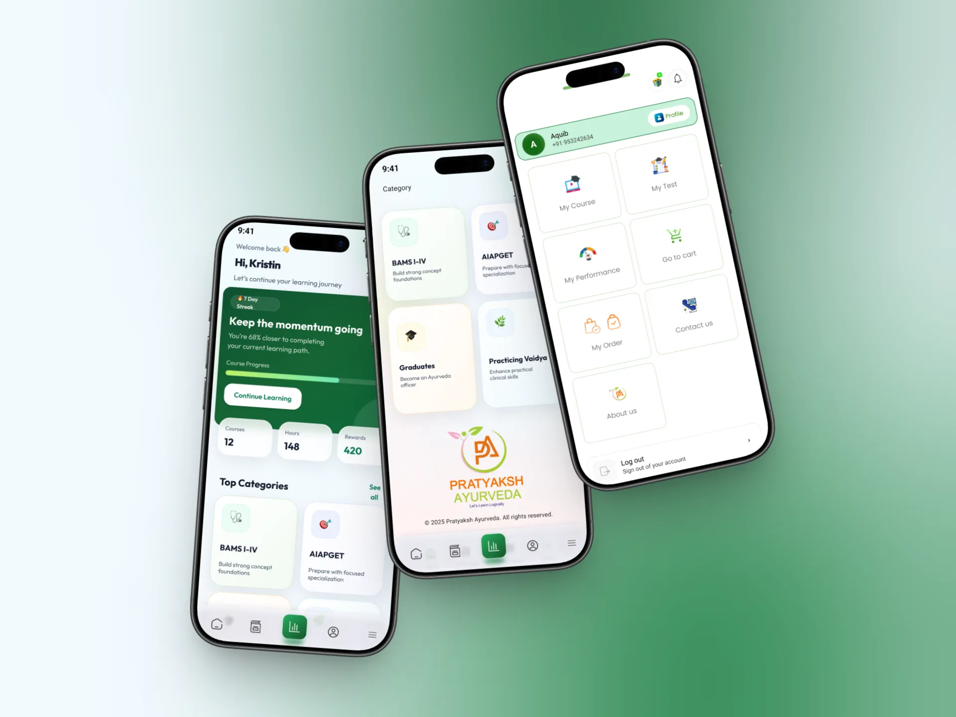
05 — Home, discovery & navigation
Home
Home Page Redesign
Home
Recommendations
Personalisation
Navigation
Full Menu Redesign
Mobile Menu
Navigation
IA
Discovery
Categories + Course Cards
Categories
Course Cards
Filtering
Content
Course, Subject & Test Series Pages
Course Page
Subject Page
Test Series
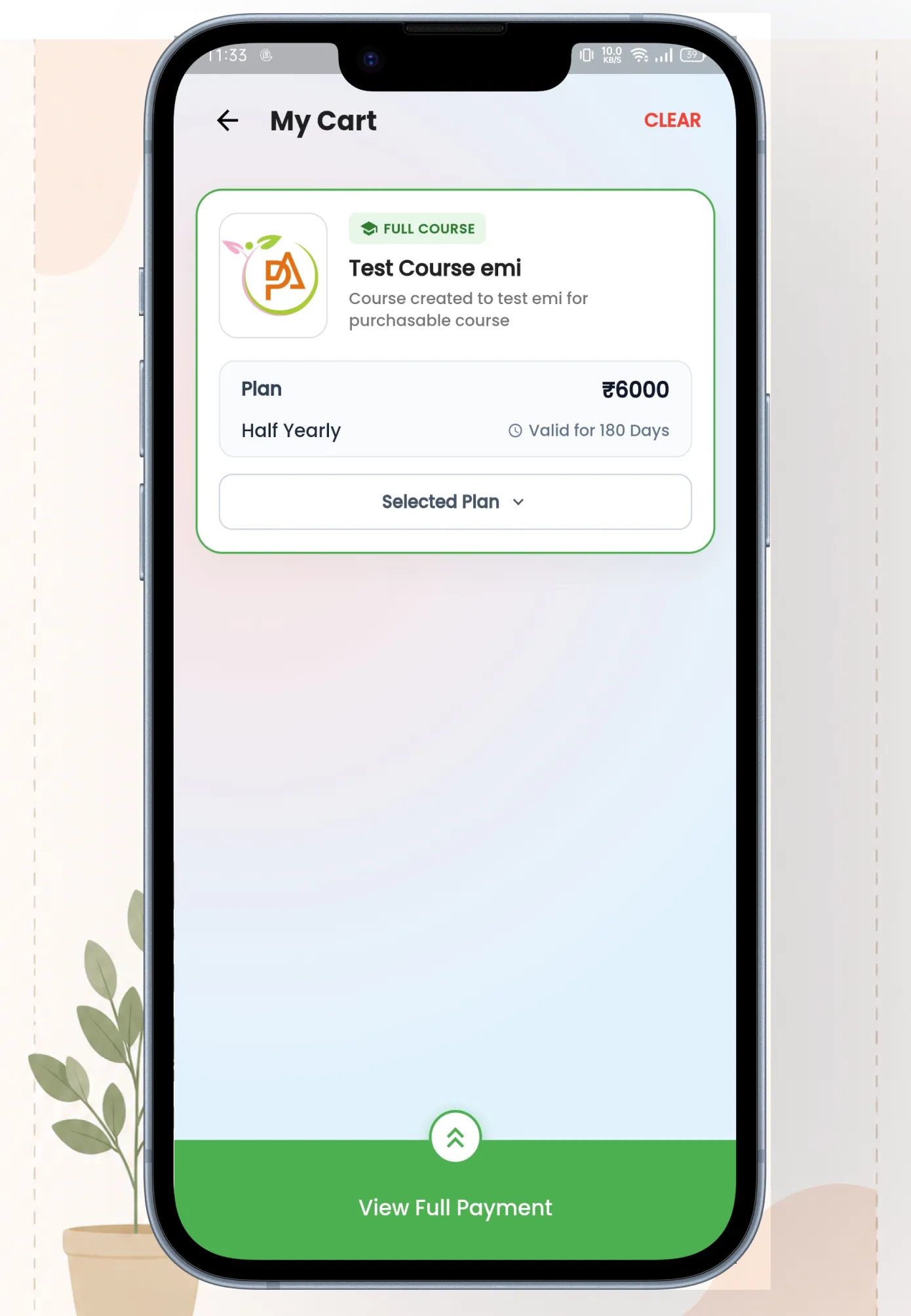
06 — Payment flow — 9 versions to get it right
v1
Basic checkout
v2
+ Price
breakdown
v3
+ Coupon code
v4
+ Point discount
v5
+ EMI option
v6
+ Offline EMI
v7
+ Trust signals
v8
+ UX research
fixes
v9 ✓
Final — all
working
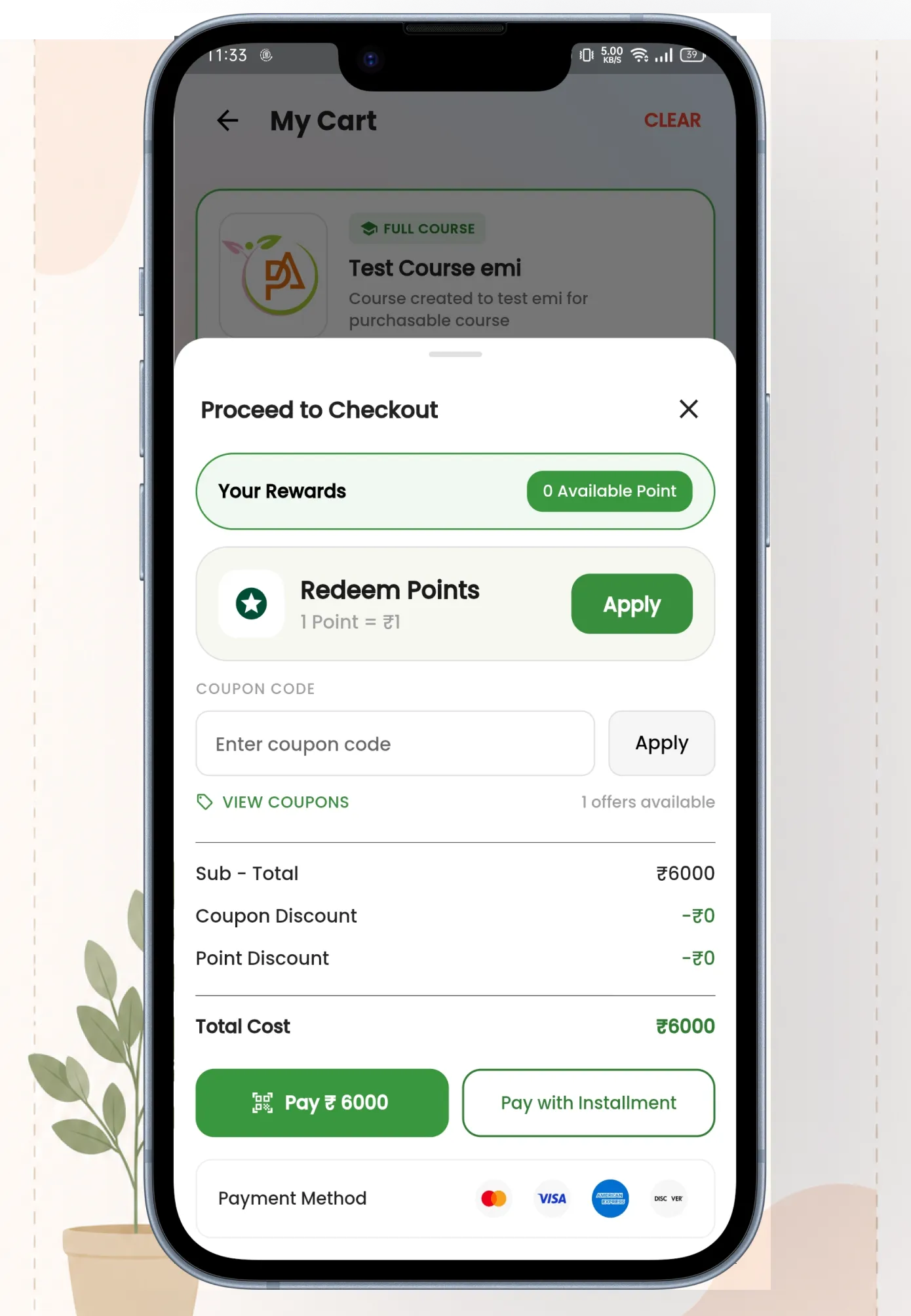
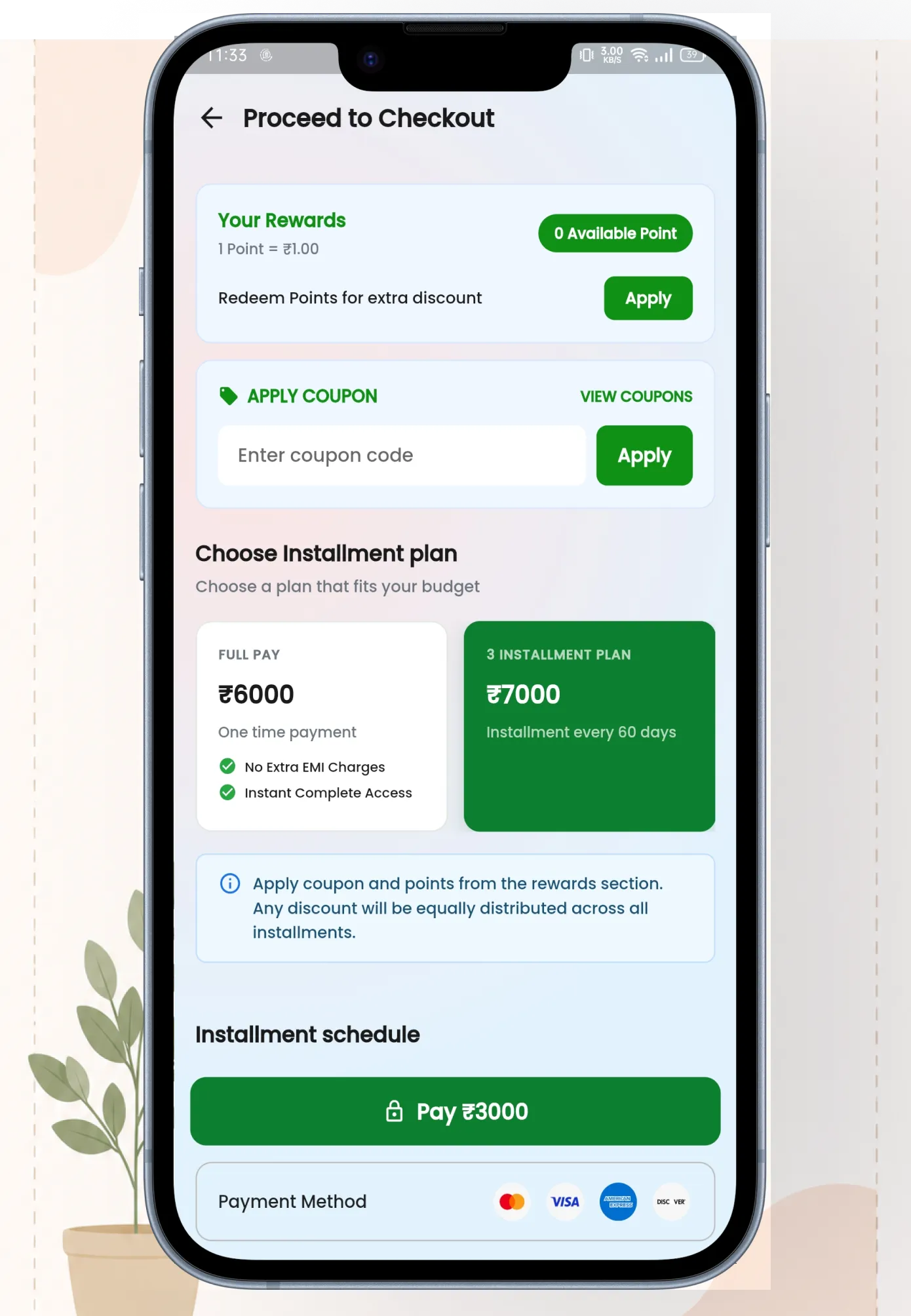
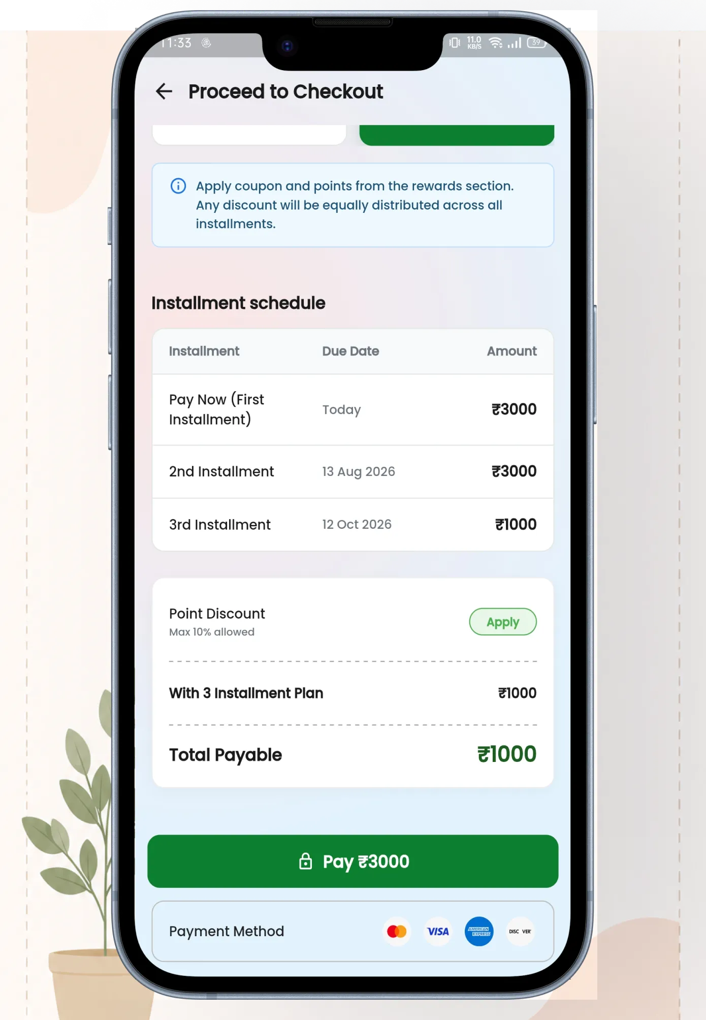
07 — Custom EMI system
Three EMI Plans
Quarterly, half-yearly, and annual payment plans.
Each plan shows the total price, installment
amount, due dates, and how much the student
saves compared to paying in full.
Quarterly · Half-Yearly · Annual
EMI Schedule View
Students can see their complete EMI schedule —
every installment, due date, amount, and status
(paid, upcoming, overdue). Full transparency so
there are no surprises.
EMI Schedule
Online + Offline Payments
Online EMI goes through the payment gateway
with automatic reminders. Offline EMI lets
students pay via bank transfer or in person —
admin marks it as paid from the backend. Both
tracked in one place.
Online · Offline
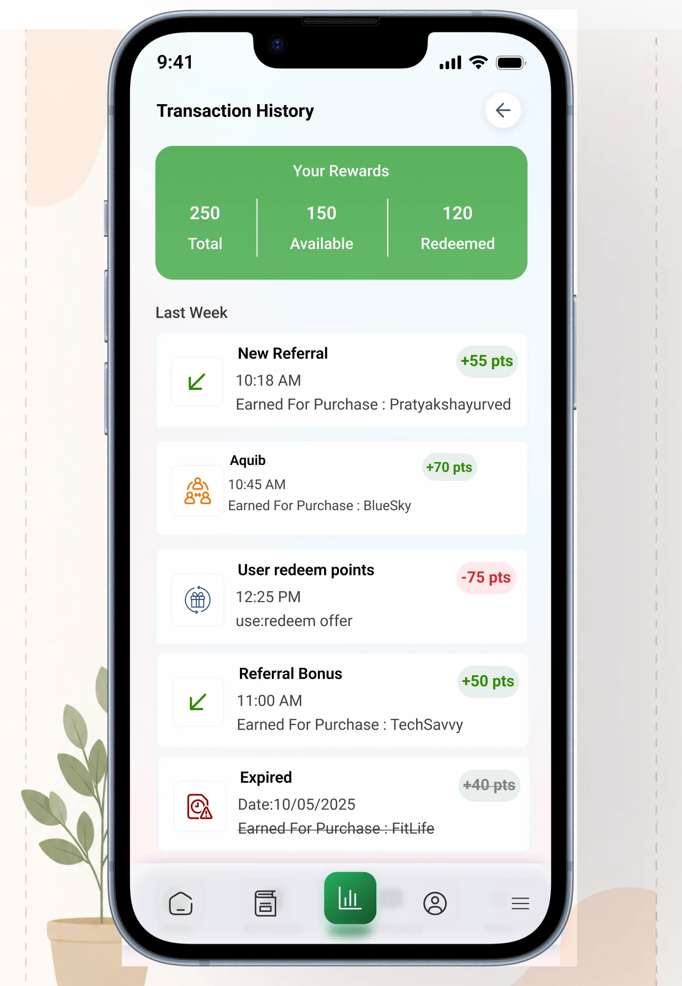
Transaction History
Complete transaction history for every payment
— full payments, EMI installments, refunds, point
redemptions. Filterable by date and course.
Downloadable receipt for each transaction.
History · Receipts
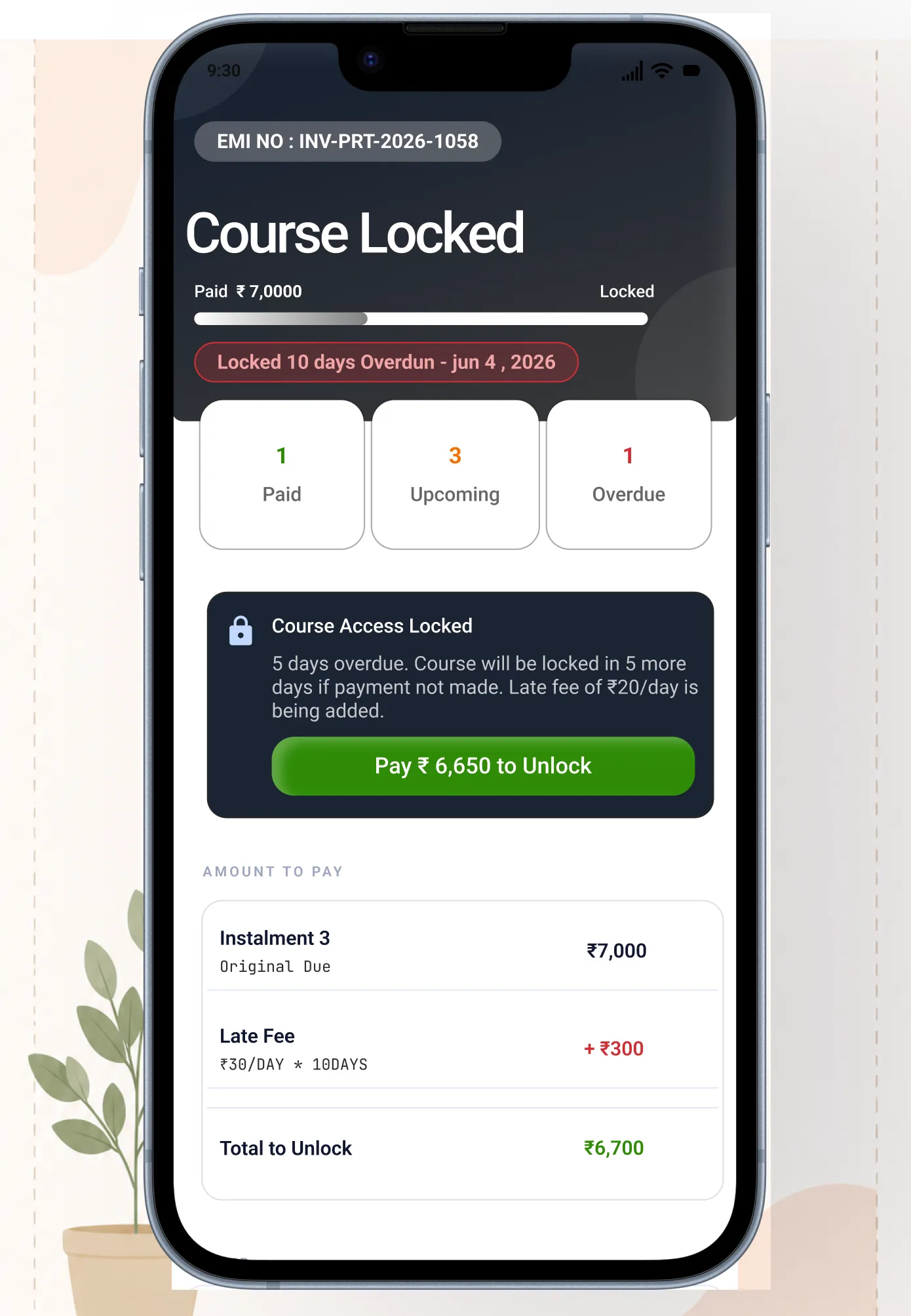
Course Lock on Overdue
If a student misses an EMI payment, their course
access is automatically locked. The app shows
exactly which payment is overdue, how much is
due, and a direct link to pay. Clear, not punishing.
Auto Lock · Overdue Alert
Admin Controls
EMI punctuality rules set from the backend by
the client. Grace period, late fees, lock timing —
all configurable. Admin can manually mark offline
payments and override locks when needed.
Backend Configurable

08 — Referral & points system
Share Referral Code
Student shares their unique referral code
with a friend
Points Credited
Both users earn points — credited
automatically to their account
Friend Signs Up
New user signs up using the referral code
during onboarding
Use at Checkout
Points redeemable for up to 10% discount
on any course purchase

09 — Real-time notifications
A real-time notification system was designed for both the user-facing app and the admin panel. Students
get notified about new live classes, EMI reminders, course updates, test results, and promotional
announcements. Admins can push targeted notifications to specific user segments.
User Side
Student Notification Modal
Real-time
Grouped
Read States
Admin Side
Admin Notification Controls
Admins can push targeted notifications to all users, specific course enrollees, or students with overdue EMIs. Scheduled notifications for upcoming live classes and test series automatically sent at set times.
Targeted
Scheduled
Admin Panel
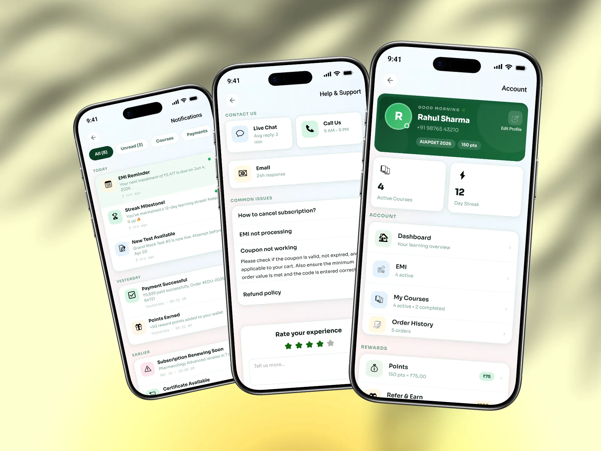
10 — User profile, settings & help
Profile Dashboard Tabs
User Profile
Dashboard
My Courses
Order History
Points
Reports
Notifications
Settings
Help & Support
Logout
Profile
User Profile — Edit Permissions
Profile Image
Phone
Password
Study Status
Settings
Settings — Full Control
Change Password
Change Email
Privacy
Delete Account
Help
Help & Support
Chat
Call
Feedback
Performance
My Performance & Reports
Test Scores
Progress
Points Report
11 — What changed
9+
Payment flow versions tested before
final
100%
Of screens redesigned — nothing left
untouched
EMI
Entirely new payment system —
online + offline
0→4
Flow maps built from scratch — none
existed before
12 — What I learned
Map before you design
No flow maps existed when I started. Building
them first — before any screen work — was the
single most important decision I made on this
project. It saved weeks of redesign.
Android first, always
87%+ of users were on Android. Designing for iOS
aesthetics first would have been wrong. Tap
targets, bottom sheets, back navigation — all
designed for how Android users actually interact.
9 versions is normal
The payment flow went through 9 versions. That's
not failure — that's design working properly. Each
version was better because of what the previous
one taught us. Ship, learn, iterate.
Deleting and rebuilding is okay
The user account section was designed, deleted,
and rebuilt completely. The second version was
much better. Sometimes the right move is to start
over rather than patch something that's
fundamentally wrong.
Payment UX is trust design
For students spending ₹5,000–₹15,000, every
element of the payment screen is a trust
decision. Security signals, clear pricing, and EMI
transparency aren't features — they're conversion
tools.
Real testing changes everything
The difference between v1 and v9 of the payment
flow came entirely from real user testing and UX
research. No amount of solo thinking replaces
watching a real student try to use what you built.
Mohd Aquib Javed
UI/UX Designer & WordPress Developer · Lucknow, India · Open to full-time, freelance
Want to work together?
nemesisgraphic19@gmail.com